Rise
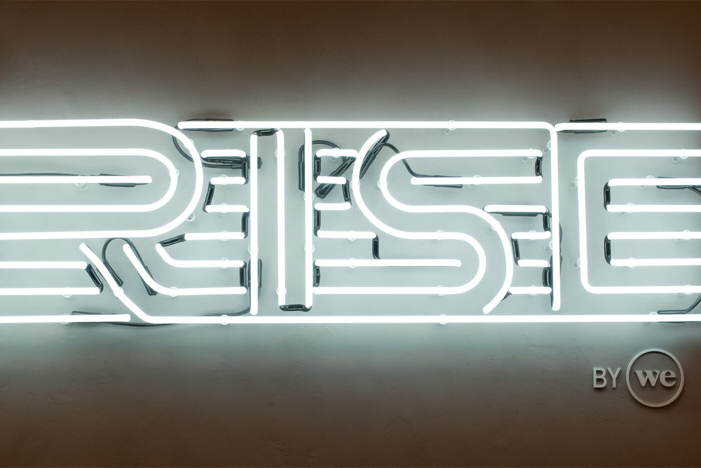
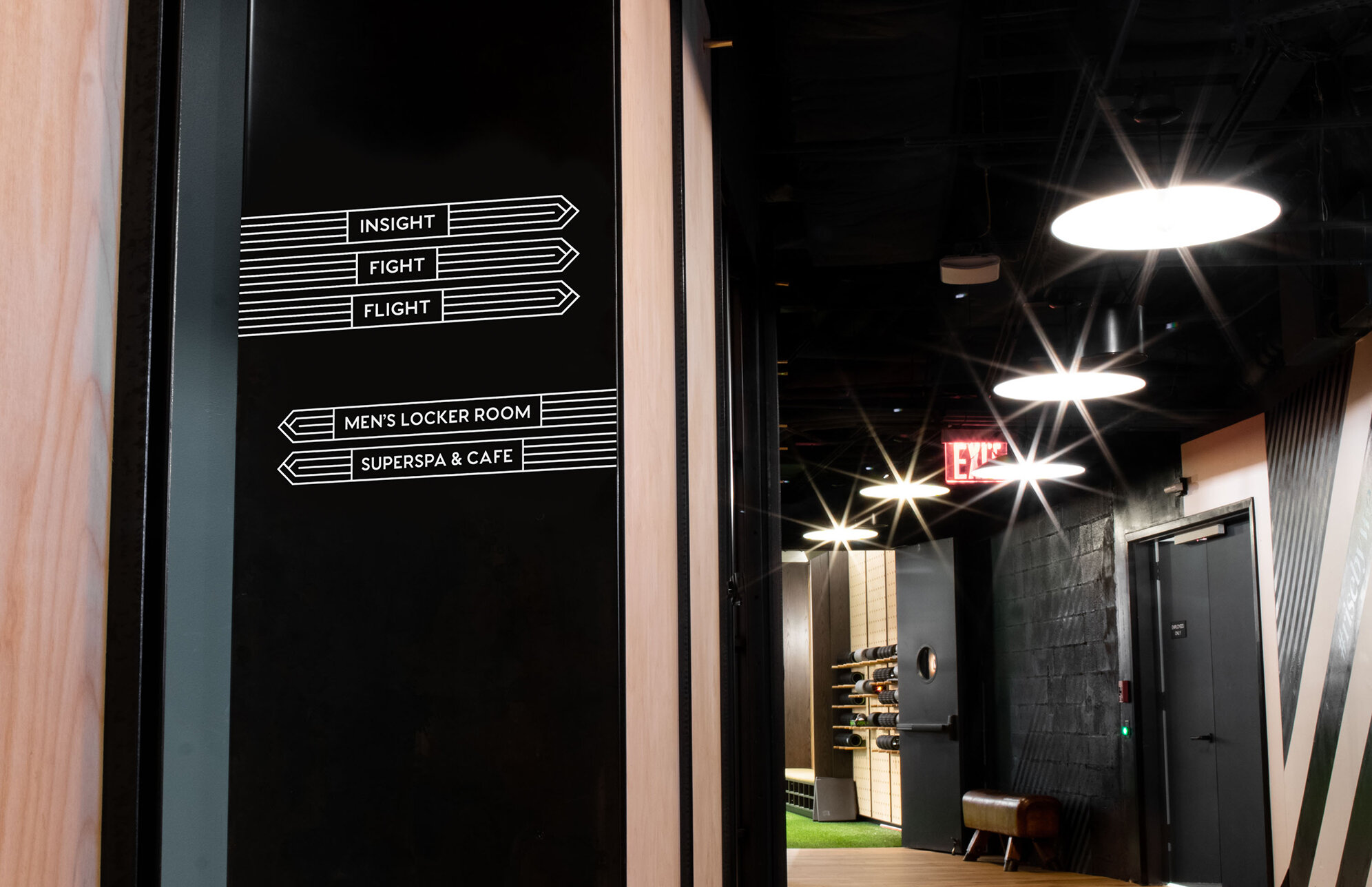
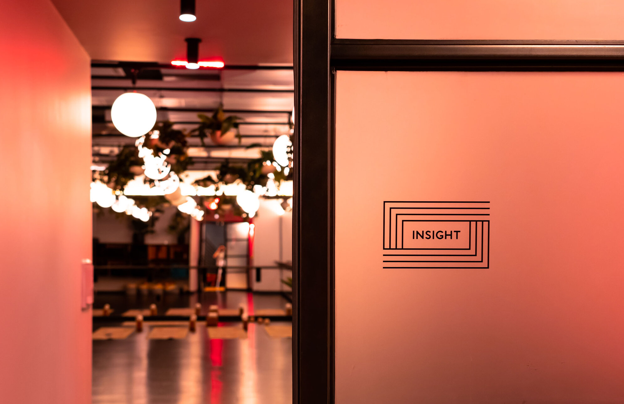
Since its inception, WeWork has always valued physical and mental health both in and outside of the workplace. When they set out to open their first wellness center in downtown Manhattan they needed help creating an identity and framework for the new sub-brand, Rise, as well as signage, naming, wayfinding graphics, web design and packaging.
Channeling the energy that’s present at the core of their DNA, we created a visual system for their new venture in wellness. Starting from a logotype comprised of expansive lines that echo the same energy and vitality of WeWork’s members and employees, we created a brand that redefines wellness centers.
Combining a Roman-style “Superspa” with a yoga studio, massage rooms, several different style gyms, a cafe and a lounge, Rise is setting a new standard for how to reconnect.
Credits–
Client: WeWork
Studio: Mucca
Creative Direction: Matteo Bologna
Design Direction: Andrea Brown
Strategy & Design: with Maria Silva Mora
Photography: Chris Caldwell


